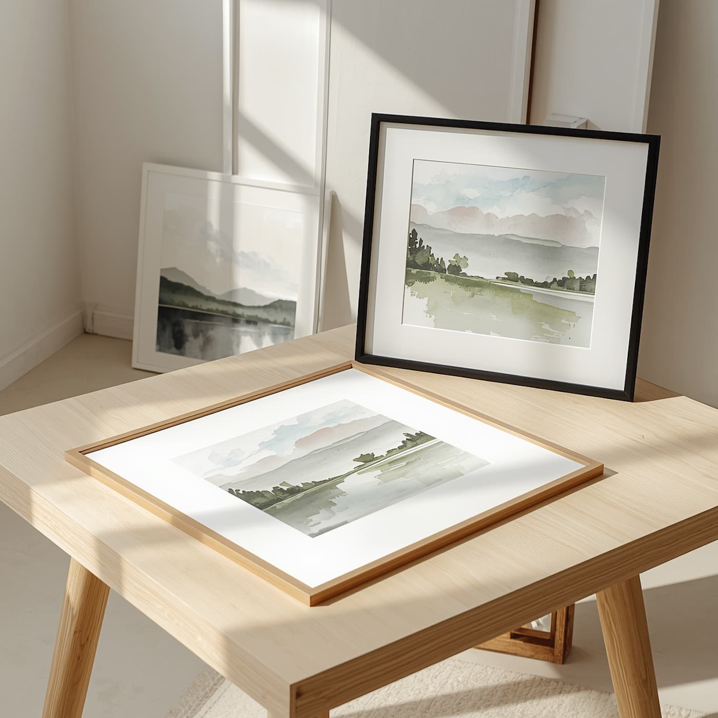
Have you finished a painting but don’t know which frame to choose? Read on, because with a few clear guidelines, choosing the right frame is much easier than it might seem.
What a Frame Actually Does for Your Painting
A picture frame serves three purposes at once: it protects the artwork from knocks and dust, visually separates it from the wall, and helps draw the viewer’s attention to what you have painted. That’s why it’s not just a decorative accessory, but the final brushstroke of the process. A well-chosen frame makes a painting feel complete, while a poorly chosen one can take away all its impact.
Factors to Consider When Choosing a Frame for a Painting
If you’re wondering how to choose a frame for a painting, the answer starts with taking a good look at the artwork. Before visiting a framing shop or buying online, it’s worth considering four aspects that, once clear, make the rest of the decisions fairly straightforward.
Color: Enhance the Artwork, Don’t Compete With It
The golden rule is that the frame should never take the spotlight away from the painting. It doesn’t have to match any color in the artwork exactly, but it should complement them. A shade close to the dominant colors will usually blend in better than one that feels completely unrelated to the piece.
If your painting features soft or pastel tones, you could try a slightly bolder frame to give it more impact. On the other hand, when the artwork is very vibrant, neutral frames (natural wood, white, black, or gray) tend to work better, allowing the colors to breathe. Black and wood are safe choices, although sometimes an unexpected shade can give the piece more personality.
The Style of the Painting and the Frame
The style of the artwork sets the direction. A classic or figurative painting often looks great with a traditional molding, while an abstract or contemporary piece calls for clean lines and slim profiles. If the painting is already full of detail, a discreet frame helps avoid overwhelming the eye. If it’s very simple, it can handle a frame with more presence.
The Space Where You Plan to Hang It
Think about the wall before the painting. Avoid choosing a frame that is the same color (or almost identical in shade) as the wall, as it would no longer serve its purpose of framing the artwork, and the painting could appear to blend into the background. The overall setting also matters: in a room with lots of furniture and objects, a simple frame creates a cleaner look, while in a very understated space, a frame with more character adds a point of interest.
If the painting will be exposed to direct sunlight or placed in a humid area, such as a kitchen or bathroom, this should be considered from the beginning. Light and humidity can affect both the pigments and the paper, and later you’ll see which materials can help protect them.
Frame Size and Thickness
Thick frames with wide moldings add weight and presence, and they tend to suit large-format paintings. Slim profiles feel lighter and work better with smaller pieces or arrangements featuring several paintings. As a practical rule, the more delicate or subtle the artwork, the less likely it is to benefit from an overpowering frame.
Types of Picture Frames and When to Choose Each One
There are many styles of picture frames, but most fall into a few main categories. This list serves as a quick guide to help you decide where to start:
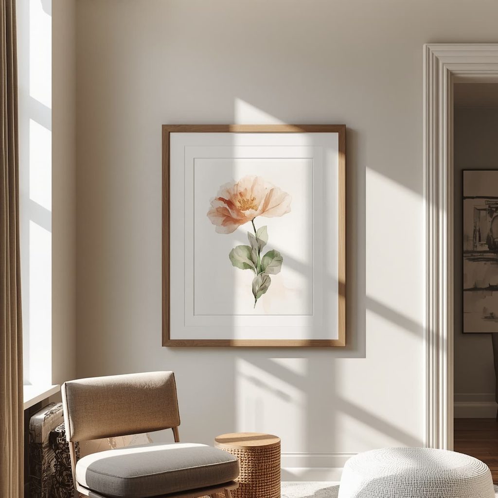
- Wooden frame: Adds warmth and works with both classic and rustic styles. It is particularly well suited to oil paintings and landscapes.
- Aluminum or metal frame: With a slim profile and modern finish, it is ideal for contemporary artwork and multi-piece compositions.
- Gallery frame: Simple lines and a discreet presence allow the artwork to take center stage. It is often a safe choice when you’re unsure.
- Floating frame: The painting appears to float inside the frame, with a small visible gap between the edge of the canvas and the molding. It works particularly well for a standalone piece.
- Gold or ornate frame: Evokes the Baroque style and pairs well with classic artwork. However, be careful, as it may attract more attention than the painting itself.
If you’re not sure which one to choose, start with a simple profile in natural wood, white, or black. It’s usually difficult to go wrong with these options, and you can always add more personality with a mat.
Framing Oil, Acrylic, or Watercolor Paintings: The Technique Matters Too
The medium you used to paint influences the framing process almost as much as the color. An oil painting on canvas doesn’t need the same protection as a watercolor on paper, and this is where most framing mistakes happen.
A Frame for an Oil or Acrylic Painting
Oil and acrylic paintings on canvas are usually framed without glass, as glass can cause reflections and, in humid areas, trap moisture. With oil paintings, there’s another important detail: oil paint dries through oxidation, a slow process that can take months. That’s why it’s best to make sure the painting is thoroughly dry before covering it.
Wooden frames, especially those with somewhat substantial moldings, are a very common choice for this type of artwork. If you want the entire painting to remain visible, without the frame covering any of its edges, a floating frame is a very elegant alternative.
A Frame for a Watercolor or Artwork on Paper
Watercolors, graphite or charcoal drawings, and other works on paper need extra protection, which is why they are almost always framed with glass or acrylic glazing. In addition, the paper must be kept separate from the glass: if it comes into contact with it, condensation may form and damage the artwork.
This is where the mat comes in: the board that surrounds the painting and creates a small air gap between the paper and the glass. Besides protecting the artwork, it provides visual breathing room, making the watercolor look cleaner and more elegant.
A practical tip: if you already know you’ll be framing your artwork, paint on a standard paper size. This will make it easier to find ready-made frames and, in many cases, help you avoid custom framing, which is usually more expensive.
Glass, Acrylic Glazing, and Mats: The Accessories That Protect Your Artwork
Beyond the frame itself, these elements influence how the painting looks and how it ages. It’s worth deciding on them at the same time as the frame, rather than afterward:
- Anti-reflective or satin-finish glass: Reduces glare and reflections, allowing you to view the artwork from different angles.
- Acrylic glazing: Lighter and more impact-resistant than glass, some types also include a UV filter. However, it scratches easily, so it needs to be handled carefully.
- Mat: Separates the artwork from the glass and provides visual breathing room. Light or neutral shades usually work best.
- Acid-free materials: For works on paper, the mat and backing board should be conservation-grade to prevent the paper from yellowing over time.
If you’re framing a piece you want to preserve for years, seek advice from a professional framing shop. A specialist can guide you on conservation materials and the proper mounting techniques.

How to Try a Frame Before Making Your Decision
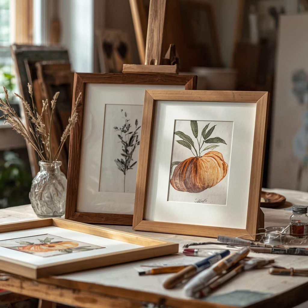
A very practical way to avoid surprises is to simulate the result at home. Cut a piece of cardboard roughly the size of the painting, attach it to the wall where the artwork will hang using painter’s tape, and check how it looks from different distances.
If possible, visit a framing shop with your artwork. Comparing several molding samples alongside the actual painting will help you make a decision, because a frame’s color can look very different when seen next to the original pigments.
How to Frame Several Paintings on the Same Wall
When combining several artworks, the frame becomes the element that either unifies or differentiates the arrangement. If you’re looking for an orderly, symmetrical result, use identical or very similar frames in terms of profile and color. If you prefer a more relaxed composition, you can mix sizes, thicknesses, and finishes, as long as there’s a common thread, such as color or material.
What you should avoid is choosing a frame simply because you already have others like it at home. Each painting deserves to be considered on its own merits.
Common Mistakes When Framing a Painting
There are a few mistakes that come up time and again when framing a painting. These are the most common:
- Using a frame that is the same color as the wall, causing the artwork to lose its outline.
- Choosing a frame that is more eye-catching than the painting itself.
- Placing glass directly over a watercolor without a mat in between.
- Covering a freshly finished oil painting with glass before allowing it to dry properly.
- Forgetting about the place where the painting will hang, including direct sunlight or humidity.
Avoiding these five mistakes already puts you well ahead when it comes to framing. Everything else comes down to personal taste and taking your time to experiment.
When You’re Unsure About the Frame: Trust Your Eye and Ask for a Second Opinion
There are no hard and fast rules when it comes to framing, and just as with painting, there’s room to experiment. If you’ve considered color, style, space, and technique and you’re still undecided, trust your eye and consult a professional framer. They may suggest combinations you hadn’t considered.