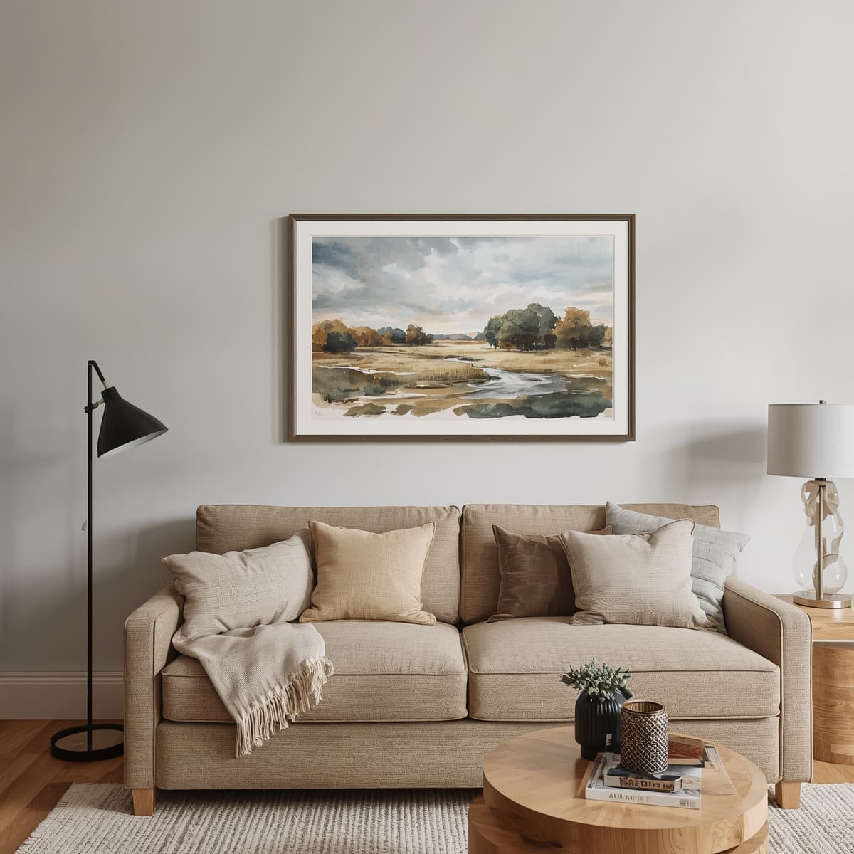
Do you have an empty living room wall and no idea where to start? Here you’ll find practical ideas for choosing styles, sizes and colours so your next piece of art fits perfectly from the start.
Living Room Wall Art: Start by Defining the Style of Your Space
Before buying anything, take a moment to look around your living room. Your interior design style (Scandinavian, classic, rustic, modern or eclectic) determines which types of artwork will feel natural and which will look out of place.
It also helps to consider the role you want the artwork to play. It can be the main focal point of the wall or a finishing touch that complements the decor. This decision will influence the size, colour and subject matter.
Living Room Paintings to Suit Different Interior Styles
Every space calls for a different type of artwork. These combinations work well and provide a starting point for choosing your living room paintings.
Scandinavian and Minimalist Living Rooms
In a Scandinavian-style living room with light wood and plenty of white, artwork with clean lines and a soft colour palette works particularly well. Think greys, beiges, muted greens and pale blues. Less is more, so a single, well-placed piece often looks better than several smaller ones.
Watercolours with delicate brushstrokes are especially well suited to this style because they share the same sense of lightness and openness. A landscape or a flower in soft tones adds a feeling of calm without overwhelming the space.
Classic and Elegant Living Rooms
Classic living rooms lend themselves to landscapes, seascapes and still-life paintings in warm tones, complemented by more elaborate frames or dark wood finishes. Traditional-style artwork adds depth and gives the room a timeless character.
Rustic, Mediterranean and Boho Living Rooms
If your home features natural fibres, wood and ceramics, look for artwork in earthy tones, sea blues or countryside greens. Coastal and rural landscapes work particularly well in these warm, inviting spaces.
In a boho living room, you can mix sizes, frames and textures more freely. The key is to maintain a common colour or two that ties everything together.
Modern and Contemporary Living Rooms
Modern living rooms can accommodate abstract art, bold colours and large-format pieces. A painting with a strong accent colour, such as mustard yellow, terracotta or petrol blue, can be the only striking feature in an otherwise neutral room.
The important thing is to ensure that the artwork does not compete with the rest of the decor. If your sofa or rug already makes a strong statement, a painting with a more restrained palette is usually the better choice.
Watercolours for Living Room Decor: Lightness, Light and Colour
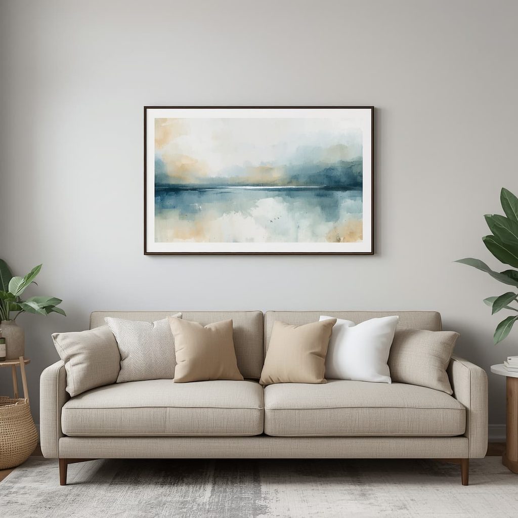
Watercolours for living room decor have a charm that sets them apart from other painting techniques. Because they use transparent pigments, light from the paper shines through the layers, giving the artwork a luminous quality and a freshness that is difficult to achieve with thicker paints.
Their visual lightness makes them highly versatile. They can complement a small living room without overwhelming it, soften a space with bold furniture or introduce a handcrafted touch to an otherwise technology-driven interior.
What’s more, every original watercolour painting features subtle variations in colour and the flow of water, making it one of a kind. This uniqueness is exactly what many people look for when they want their living room to feel different from everyone else’s.
Watercolour Subjects That Work Best in a Living Room
There is no single right subject for a living room. However, certain options tend to look particularly good above a sofa or on the main wall:
- Landscapes: Fields, mountains and forests that bring a sense of calm and depth.
- Seascapes: Waves, beaches and harbours that refresh the space, especially when paired with blue and sandy tones.
- Flowers and botanical art: Add colour and delicacy, and complement almost any interior.
- Urban landscapes: Streets, squares and building facades that are perfect for modern or travel-inspired living rooms.
Large-Format Watercolours: When Are They Worth It?
A large watercolour becomes the focal point of a living room, provided the wall is relatively uncluttered. The larger the artwork, the more important it is to choose the right frame and consider the lighting it receives.
Choosing the Ideal Painting Size for Your Sofa and Wall
A common mistake is hanging a painting that is too small for the piece of furniture beneath it. The result can look disconnected, as though the artwork is floating without purpose. As a general rule, a painting or group of paintings should occupy between 60% and 75% of the sofa’s width.
These guidelines will help you work out the right size without overcomplicating things. You don’t need to measure everything down to the last millimetre, but having a clear reference point before buying is essential.
- 200 cm sofa: Look for a painting or a group of pieces measuring between 120 and 150 cm in total width.
- Uncluttered wall and spacious living room: A large-format piece works well as the main focal point.
- Small living room or low ceilings: A vertical piece creates a sense of height without taking up too much horizontal space.
Height and Placement: How to Hang Paintings in Your Living Room
The right height is one that allows you to enjoy the artwork comfortably. As a general rule, hang it so that its centre is approximately 145–150 cm above the floor, roughly at the eye level of a standing adult.
Above a sofa or sideboard, leave around 15–20 cm between the furniture and the bottom edge of the frame. This helps the two elements read as a cohesive arrangement rather than separate objects. If you hang the painting too high, it will feel disconnected from the rest of the room.
Before drilling into the wall, try this useful trick: cut out paper templates in the same sizes as your paintings and attach them to the wall with masking tape. This lets you visualise the final arrangement, adjust the spacing and avoid unnecessary holes.
Wall Art Arrangements: Diptychs, Triptychs and Gallery Walls
When a single piece isn’t enough, diptychs and triptychs divide an image into several panels that work together as one striking artwork. They are a practical solution for wide walls, such as the one behind a three-seater sofa.
A gallery wall featuring artwork in different sizes allows you to combine watercolours, art prints and photographs. To prevent the arrangement from looking chaotic, maintain consistent spacing of 5–10 cm between frames and look for a unifying element, whether it’s colour, frame style or subject matter.
How to Match Your Painting’s Colours with the Rest of Your Living Room
Artwork looks its best when it complements its surroundings. These ideas will help you create harmony without overwhelming your living room:
- Repeat one of the artwork’s main colours in cushions, throws or curtains.
- If your living room has a neutral palette, let the painting provide the pop of colour.
- If your sofa and rugs already feature plenty of colour, choose artwork with a softer palette.
- Limit the artwork to two or three dominant colours to maintain a cohesive look.
Frames, Mounts and Glass for Living Room Watercolours
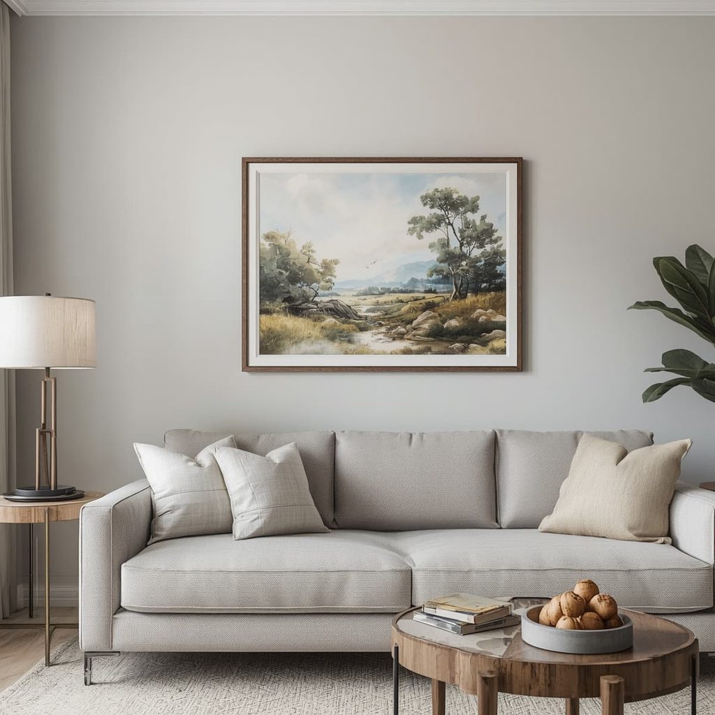
Watercolours need protection, so a frame with glass or acrylic glazing is almost essential. A mount separates the paper from the glazing and creates visual breathing room, which is particularly noticeable with large-format pieces.
When choosing a frame style, light wood works well in Scandinavian or Mediterranean living rooms, slim black frames suit modern interiors, and dark or gold finishes complement classic spaces. If you’re unsure, opt for a discreet frame and let the artwork take centre stage.
Lighting and Care: How to Protect Your Living Room Paintings
Direct sunlight is a watercolour’s biggest enemy because it can cause pigments to fade over time. If your living room has large windows, hang the artwork on a wall that doesn’t receive direct sunlight or use UV-filtering glazing.
Artificial lighting, on the other hand, can work in your favour. A spotlight or wall light with a warm glow directed towards the painting can highlight its textures and colours, provided the light isn’t too intense or positioned too close to the paper.
When it comes to cleaning, a soft, dry cloth is all you need to wipe the glass. Avoid using liquid cleaning products near the frame, and check occasionally that the artwork isn’t exposed to moisture.
Original Painting, Art Print or Commission: Options for Your Living Room
An original painting is a unique piece, while an art print reproduces an artwork on quality paper and is generally more suitable for tighter budgets. Both can look excellent if the subject and colours complement your living room.
If you’re looking for something tailor-made, a commissioned piece lets you choose the format, colour palette and subject to suit your wall and decor. It’s a great option when you can’t find exactly what you have in mind and the artist accepts commissions.
How to Tell Whether a Painting Suits Your Living Room Before Hanging It
Imagine the artwork on your wall for a few weeks and ask yourself whether you still like it. If its style, size and colours work well with what you already have, you’re on the right track.