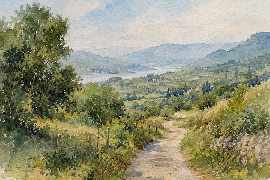
A watercolor painting can have good drawing and good color and still look flat if it doesn’t handle planes well. Here are five concrete tips for creating depth with watercolor, designed for you to apply to your next painting no matter what subject you’re working on.
Glazing involves layering transparent washes of color, letting each one dry before applying the next. Since watercolor is a semi-transparent medium, the paper and the layers underneath keep showing through, and that creates a sense of depth that a single flat layer never achieves.
To start, work in three layers: one for lights, another for midtones, and a final one for shadows, letting each dry completely between coats. This simple sequence is the foundation of almost any three-dimensional effect in watercolor and works just as well for a portrait as for a landscape.
Tonal value — that is, how light or dark a color is — matters more than the color itself when it comes to adding depth in watercolor. If the foreground has greater contrast between lights and shadows, and the background stays more uniform and soft, the eye automatically reads distance between the two. Before you start painting, a small black-and-white value sketch lets you check whether the composition works without relying on color.
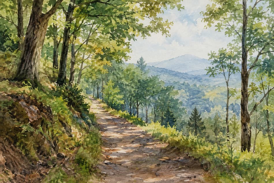
Mixing two opposite colors on the color wheel, like blue and orange or red and green, produces a neutral gray that’s far more interesting than pure black. That tonal gray is the foundation of realistic shadows, since it retains some of the original color and keeps the painting from looking dull or muddy.
Try mixing your shadow color with its complementary instead of darkening it directly with black or store-bought gray. The difference is noticeable: the shadows gain luminosity and fit better with the rest of the palette, which is key for making the depth look natural rather than forced.
In a landscape, foreground elements are usually painted with warmer, more saturated colors, while background elements are worked in cooler, grayer, less defined tones. This convention simulates how air and distance desaturate colors that are far away, and it’s one of the most effective ways to create depth in watercolor without complicating the technique.
Beyond color, edge treatment also changes depending on the plane: objects close by have crisper, more detailed outlines, while background elements are softened using the wet-on-wet technique.
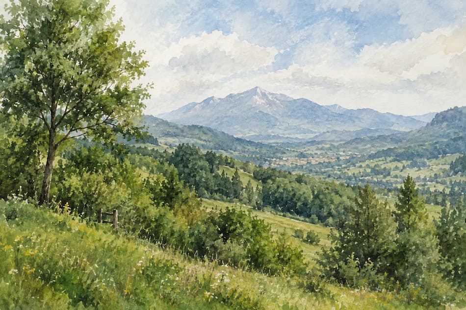
A hard edge forms when you paint on dry paper or let the paint dry before touching that area again, and it draws the viewer’s eye strongly. A soft edge, on the other hand, is achieved by working wet-on-wet or blending the boundary with a clean brush, and it works better for areas you want to go unnoticed.
As a general rule, save hard edges for your composition’s focal point and use soft edges everywhere else. That contrast between sharpness and softness is, along with tonal value, one of the most powerful tools for creating a sense of depth in watercolor.
None of these techniques works in isolation: real depth appears when you combine glazing, tonal contrast, color, and edges in the same piece. A good starting point is to plan the values and planes first, and only worry about the exact color you’ll use in each area afterward.
With these five tips, you already have a solid foundation for turning flat paintings into pieces with volume and atmosphere; the rest is practice and paying attention to how light and distance affect what you’re painting.