Have you ever mixed two colors only to end up with a dull, muddy shade? With a few clear ideas, you can mix watercolor colors with much greater control. Here are the techniques that work best.
Three Ways to Mix Watercolor Colors
There is no single way to combine pigments in watercolor. Depending on the effect you want to achieve, you can mix colors on the palette, directly on the paper, or by layering transparent washes.
Mixing Colors on the Palette
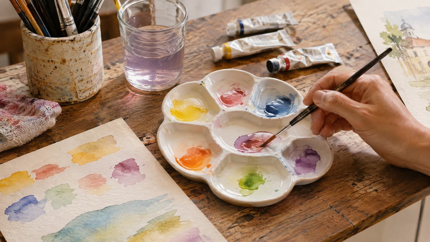
This is the most common method and the one that gives you the most control. Wet your brush, add a little water to a well in your palette, pick up pigment from two pans or tubes, and mix them until you achieve the shade you want.
Before painting, test the color on a piece of watercolor paper or a scrap of absorbent paper, then adjust it by adding more water or pigment. This way, you can create custom colors that you can reproduce throughout your painting.
Mixing Wet-on-Wet on Paper
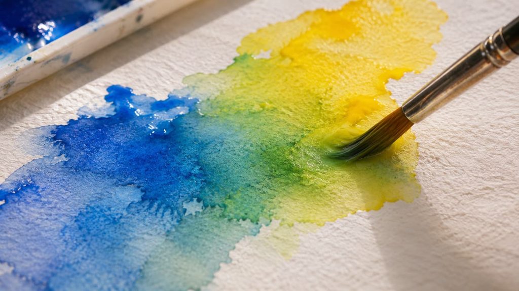
With this method, the mixing happens directly on the paper. Paint an area with one color and, while it is still wet, apply another color next to it so that the two touch and blend naturally in the middle.
This method is less predictable because the water moves on its own, but it produces fresh results and very soft gradients. You can control how much the colors blend by adjusting the amount of water on your brush and the angle of the paper.
It works especially well for skies, backgrounds, and flowers, where atmosphere matters more than detail. However, make sure both colors are equally wet, as uneven moisture can create irregular edges.
Optical Mixing with Transparent Layers
This technique involves painting one layer, allowing it to dry, and then applying another color on top. Thanks to watercolor’s transparency, the eye perceives the combination of both shades. This technique is similar to glazing and can be used to warm, cool, or darken a color without making it muddy.
Basic Palette for Mixing Watercolor Colors
You don’t need dozens of tubes to start mixing colors. With a limited palette of six colors—one yellow, one red, and one blue in both warm and cool versions—you can create an enormous variety of shades. For example:
- Yellows: lemon yellow (cool) and cadmium yellow (warm).
- Reds: quinacridone rose or carmine (cool) and cadmium red or scarlet (warm).
- Blues: phthalo blue (cool, leaning toward green) and ultramarine blue (warm, leaning toward violet).
How to Combine Watercolor Colors Using the Color Wheel
The color wheel is your best ally when you want to combine watercolor colors thoughtfully. It shows you which shades work well together and which create contrast, saving you from endless guesswork.
Analogous Colors: Harmony and Softness
Analogous colors are those that sit next to each other on the color wheel, such as yellow, orange, and red. They blend easily and create harmonious, peaceful compositions, making them ideal for sunsets or autumn landscapes.
Complementary Colors: Contrast and Lively Grays
Complementary colors are located opposite each other on the color wheel, such as blue and orange or red and green. When placed next to each other, they enhance one another and add energy to a painting.
When mixed together, however, they neutralize each other and produce rich grays and browns that are far more interesting than a flat gray from a tube. This makes them an essential tool for muting a color without resorting to black.
Triadic Color Scheme: Balance and Variety
A triadic scheme uses three colors that are equally spaced around the color wheel, such as the three primary colors. It creates vibrant compositions, and the easiest approach is to let one color dominate while using the other two in smaller amounts.
How to Create Secondary and Tertiary Colors
Secondary colors are created by mixing two primary colors, and their intensity depends on which versions of each primary color you use. These are some of the most reliable starting mixtures:
- Orange: cadmium yellow + cadmium red or scarlet.
- Green: lemon yellow + phthalo blue for a vibrant green, or cadmium yellow + ultramarine blue for a more muted, natural shade.
- Violet: quinacridone rose + ultramarine blue.
Tertiary colors, such as blue-green or red-orange, result from combining a primary color with the secondary color next to it on the color wheel. By changing the proportions, you can create a whole range of intermediate shades.
How to Darken or Mute a Color Without Using Black
In watercolor, black tends to create flat, lifeless shades. To darken a color, it usually works better to add a little of its complementary color or a deep blue, which reduces brightness while preserving the richness of the shade.
To lighten a color, simply add water, because watercolor is transparent and the light reflected by the paper does the work of white. Keep in mind that colors become slightly lighter as they dry, so it is a good idea to mix them a little more intensely than you want them to appear in the final painting.
How Much Water and Pigment Should You Use in Each Mixture?
The ratio of water to pigment changes the appearance of any mixture. A useful reference is consistency: something like tea for light washes, milk for mid-tones, and heavy cream for more intense colors.
If you mix with too much water, the color will look pale and weak. If you use too little, it will become thick and difficult to spread. Keep notes in your color-testing notebook about the amounts you used in each case so you can reproduce the results.
How to Prevent Colors from Becoming Muddy
A muddy color is a cloudy, dull shade that appears when a mixture becomes too complicated. These habits can help you avoid it:
- Mix no more than two or three pigments at a time.
- Change your water frequently and clean your brush between colors.
- Avoid mixing complementary colors excessively unless you are aiming for a gray or brown.
- Test each mixture on a separate piece of paper before applying it to your artwork.
- Allow one layer to dry completely before applying another on top.
If an area becomes muddy, let it dry and lift the excess pigment with a clean, damp brush. Depending on the pigment, you can often recover much of the original brightness.
Useful Color Mixtures for Painting Landscapes
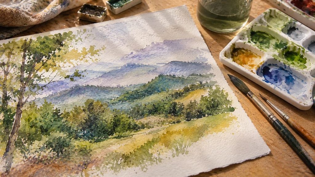
Natural greens rarely come straight from the tube. Mix a yellow with a blue and add a tiny amount of red or burnt sienna to mute it. This will give you much more natural greens for leaves, meadows, and trees.
For shadows, try mixing ultramarine with an earth tone or a red. These combinations produce bluish and violet grays full of subtle nuances. This way, your shadows will be colorful rather than dark and flat.
Create Your Own Color Mixing Chart for Practice
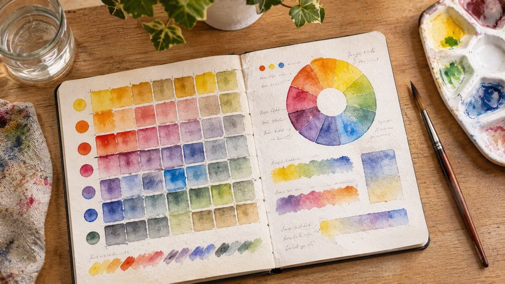
A color mixing chart is a grid where you paint each color in your palette and combine it with all the others, using rows and columns. It is a simple exercise that shows you, at a glance, the results of each pigment pair.
Write down the name of each pigment and the approximate water ratio so you can reproduce the mixtures you like best. Over time, this chart becomes your personal reference for combining watercolor colors without relying on luck.
Make it on the same type of watercolor paper you usually use, because each paper absorbs and displays pigment differently. Keep it near your workspace and refer to it whenever you are unsure about a color mixture.