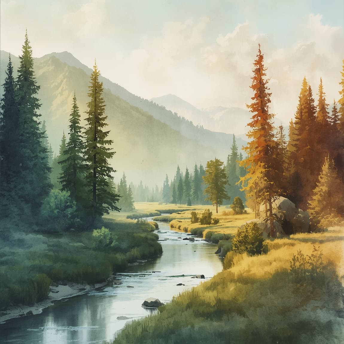
Have you ever noticed that a watercolor painting looks flat even when the drawing and colors are right? Most likely, it lacks contrast between light and shadow, and this can be fixed with a few simple ideas that you will learn below.
Why Do Light and Shadows Completely Change a Watercolor Painting?
Light and shadows are what turn a patch of color into a three-dimensional object. Without them, an apple, a cup, or a house is reduced to a flat shape, no matter how well it is drawn. With them, the painting gains depth, realism, and atmosphere.
Watercolor has a particular characteristic when it comes to this: the paint is transparent, and you cannot cover up a mistake with an opaque layer as you would with oil paint. That is why the order in which you work on lights and shadows matters just as much as the colors you use.
How to Analyze the Light Source Before Painting
Before wetting your brush, take a few minutes to observe your reference. Many mistakes when painting light and shadows in watercolor begin with not having a clear understanding of where the light is coming from.
Direction and Intensity of Light
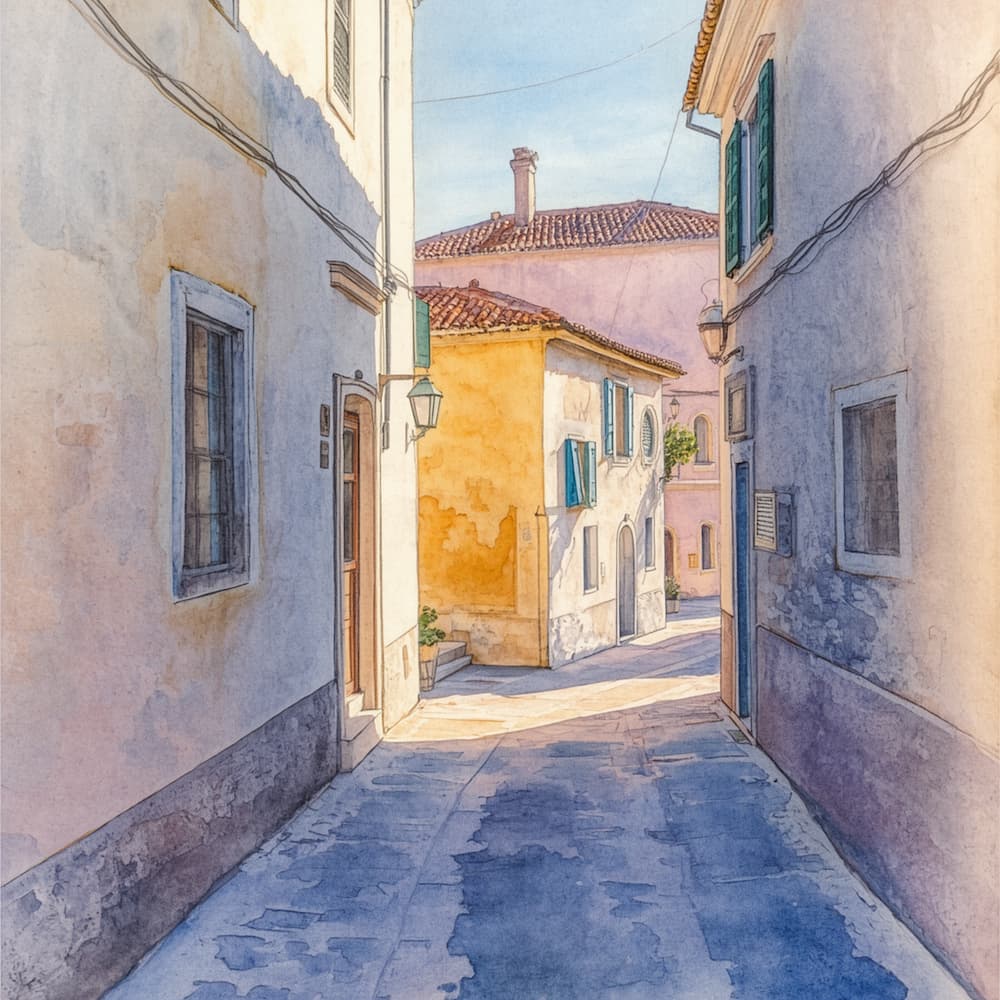
Identify the light source and observe which direction the shadows fall. Side lighting creates elongated shadows and strong contrast, while frontal lighting softens shadows and flattens the sense of volume.
Also, pay attention to the intensity. Direct sunlight creates shadows with sharp edges and very dark values, while an overcast day produces soft transitions and values that are closer together.
Form Shadows and Cast Shadows
A form shadow appears on the part of an object that does not receive light, such as the dark side of a cup. A cast shadow is the shadow that the object creates on the surface it rests on. Distinguishing between them helps you paint each with the right intensity: form shadows are usually more gradual, while cast shadows tend to be more defined near the object and soften as they move away.
The Value Scale: The Secret to Contrast
Value refers to how light or dark a tone is, regardless of its color. A watercolor painting with good values can still be understood in black and white, and that is the best sign that the light and shadows are working.
A simple way to organize your painting is to work with three value levels:
- Highlights: The lightest areas, which are almost always the color of the paper or a very diluted wash.
- Midtones: The object’s local color, with a moderate amount of pigment.
- Shadows: The darkest areas, with more pigment and less water.
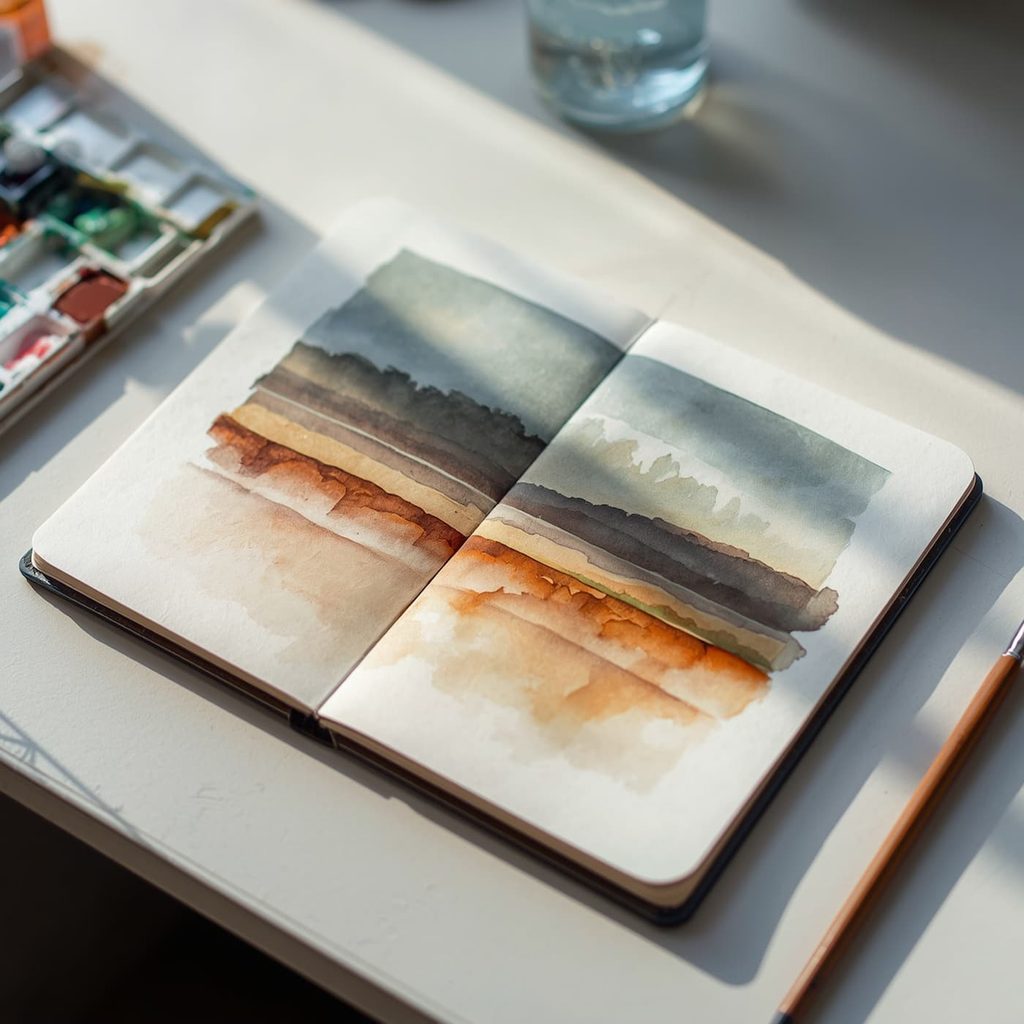
Before you start, create a small value scale using a single color, from the palest tone to the most intense. Remember that watercolor becomes slightly lighter as it dries, so it is a good idea to use a little more pigment in your shadows than you think you need.
Materials for Painting Light and Shadows with Greater Control
You do not need special equipment to get started, but some materials make working with light and shadow much easier. These are the ones that make the biggest difference:
- Good-quality, heavyweight cotton paper: It can withstand multiple layers and water without warping, which is essential for building up shadows in layers.
- A fine-point round brush: It allows you to create both broad washes and details in shadow areas.
- A palette with warm and cool colors: It lets you cool down shadows and warm up highlights.
- Absorbent paper: It is useful for lifting pigment and recovering highlights when needed.
- Masking fluid (optional): It preserves the smallest, brightest white areas.
Step-by-Step Guide to Painting Light and Shadows in Watercolor
With the light source clearly identified and the values defined, it is time to paint. This workflow works just as well for a cup on a table as it does for an entire landscape.
Step 1: Preserve the Whites and Start with the Highlights
In watercolor, the brightest light is the white of the paper, so the first thing to do is decide which areas you will leave unpainted. You can protect them with masking fluid or simply paint carefully around them.
Next, apply the lightest and brightest colors (yellows, soft ochres, pale pinks) to the areas where direct light falls. Use gentle brushstrokes and enough water to create clean transitions without leaving unwanted dark patches.
Step 2: Build Up the Shadows in Layers
Shadows are not painted all at once. Start with a very diluted wash that establishes the overall shape of the shadow, then wait for it to dry.
Over this base, add a second, slightly more intense layer only in the deepest areas, such as folds, the point where the object touches the surface, or the inside of a cup. This method, known as glazing, creates luminosity because light passes through the transparent layers and reflects off the paper.
It is easier to darken an area than to lighten it, so start with values that are slightly lighter than you need. If you are unsure, let the paint dry and compare it before adding another layer.
Step 3: Soften the Edges and Connect Highlights with Shadows
Not all shadow edges are the same. Hard edges suggest strong light and nearby objects, while soft edges suggest diffused light or forms that turn away, such as a sphere or a petal.
To soften an edge, use a clean, damp brush to moisten the transition area while the shadow is still wet, allowing the pigment to diffuse on its own (wet-on-wet technique). If you prefer a crisp edge, work wet-on-dry, with the paper already dry.
Step 4: Add Reflected Light and the Final Details
Once the overall painting is working, add a few small touches to complete the sense of volume. Within the shadow, a little reflected light (a slightly warmer and lighter tone bouncing back from a nearby surface) prevents it from looking too heavy, while a few dark accents at the points of greatest contrast provide the final boost. If your scene includes water, do not forget the light reflections on its surface.
Colors for Shadows: How to Mix Them Without Making Your Watercolor Muddy
A shadow is not simply the object’s color made darker. Black tends to dull watercolor and make shadows look lifeless, which is why many artists prefer to mix their own dark tones. These combinations work very well:
- Complementary colors: Mix the object’s color with its opposite (orange with blue, red with green) to create lively chromatic grays.
- Ultramarine blue and burnt sienna: This combination produces deep, neutral shadows that are very useful in landscapes and tree shadows.
- Cool shadows for warm light: If the light is warm, shift the shadow toward blue or violet. The temperature contrast increases the sense of light.
Test your mixtures on a separate piece of paper before applying them to your painting. This allows you to check the actual tone, since the color changes as it dries.
How to Correct an Area That Is Too Dark or Too Light
If a shadow has turned out darker than expected, you still have some room to work while the pigment is wet. Blot the excess with absorbent paper or a clean, dry brush, and avoid rubbing to prevent damaging the paper.
Once the paint is dry, dampen the area with a clean brush, allow the water to dissolve the pigment for a few seconds, and lift it with absorbent paper. The result depends on the pigment and the paper (staining pigments cannot be fully lifted), so test the technique first in an inconspicuous area. And if the area simply needs to be darker, all you have to do is add another glaze on top.
A Simple Exercise to Practice Light and Shadow in Watercolor
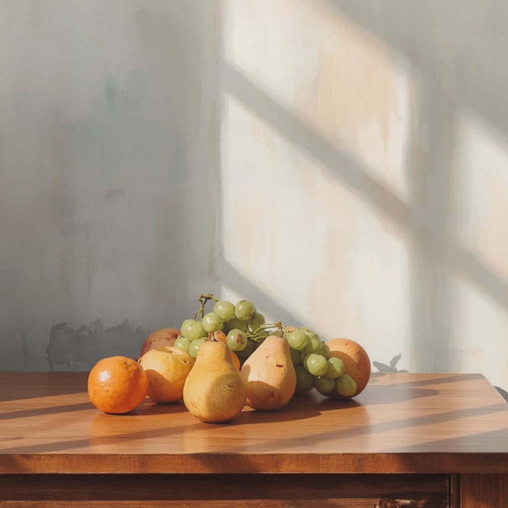
To put everything you have learned into practice, you do not need a complex composition. A cup on a table, a piece of fruit, or a drawn sphere are ideal subjects because they have a clear light source and easy-to-read shadows.
Place the object next to a lamp or a window so that it receives light from one side, and make a simple sketch. Then identify the brightest area, the midtone, the form shadow, and the cast shadow, and paint in that order: highlights first, then the base color, and finally the shadows in layers.
Repeat the exercise by changing the position of the light, and you will see how the distribution of values changes. After three or four repetitions, you will notice that you begin to anticipate where each shadow will fall before painting it. That is precisely what gives you confidence when painting landscapes, portraits, or still lifes.
Mistakes That Dull the Light in Your Watercolor Painting
The most common mistake is darkening areas too soon: when the entire paper is covered in midtones, there is no room left for the light. Another classic mistake is painting all the shadows with the same intensity and identical edges, which makes the scene look less natural.
It is also important to watch out for using too much water and being impatient: if you add layers over paint that is still wet, the colors mix and become muddy. Respect drying times, observe before painting, and remember that every watercolor painting is an opportunity to refine your eye.