Wet-on-wet, wet-on-dry, and glazing: the three techniques that underpin all watercolor painting
When someone starts with watercolor, they usually think the problem is the drawing, the color, or the quality of the materials. Almost never is that the case. The problem, almost always, is the water: how much there is in the brush, how much there is on the paper, and when the two come together.
All watercolor, no matter how complex it may seem, rests on three ways of managing that relationship. If you understand them and practice them separately, you stop painting “to see what comes out” and start making decisions.
Before you start: four things about the materials
You don’t need to spend a lot, but you do need to spend wisely. In watercolor, the order of importance is not what most people imagine:
Paper comes first: Before colors and before brushes. A 300 gsm, 100% cotton, medium-grain paper makes possible what is simply impossible on cheap paper: the color stays afloat long enough for you to work with it. If your budget is tight, buy fewer colors and better paper.
Few colors, well chosen: Six or eight tubes are enough to paint practically anything. A short palette forces you to mix, and mixing is what truly teaches you about color. Forty pans in a school set only teach you to hesitate.
Two brushes are enough to start: One large brush with a good water reservoir for backgrounds and washes, and a medium one with a fine point for detail. The large brush is the one that causes the most fear and the one you need the most.
Two water jars, not one: One for washing the dirty brush and another clean one for diluting. It is the cheapest trick there is to stop your colors from turning gray without knowing why.
And something that isn’t a material, but works just as well: keep a piece of the same paper you’re using nearby, to test the mixture before touching the sheet. It saves more frustration than any technique.
White is not painted: it is reserved
In oil or acrylic, white is added. In watercolor, white is the paper, and once you cover it, it does not come back. This completely changes the way you plan: instead of thinking “where do I put the light?”, you think “where am I not going to paint?”
Before making the first mark, stop for thirty seconds and identify the areas that will remain the lightest parts of the painting: the shine of a wet roof, the foam of a wave, the illuminated edge of a figure, a white wall in the sun. Those areas are left untouched.
There are three ways to reserve:
Painting around it (brush reservation). It is the most difficult and the one that gives the best results: the edges remain alive, made by the hand.
With masking fluid. Practical for small, scattered details (sparks of light, thin branches, masts). Apply it with an old brush or an applicator, never with your best brush, and remove it only when the paper is completely dry. It leaves very hard edges, so use it carefully.
Lifting afterward. With the paper still wet, or already dry with a clean brush, you can recover some of the white. Never completely, but sometimes it is enough.
Watercolor paintings that seem “luminous” almost always are because of what is not painted, not because of what is painted.
1. Wet-on-wet
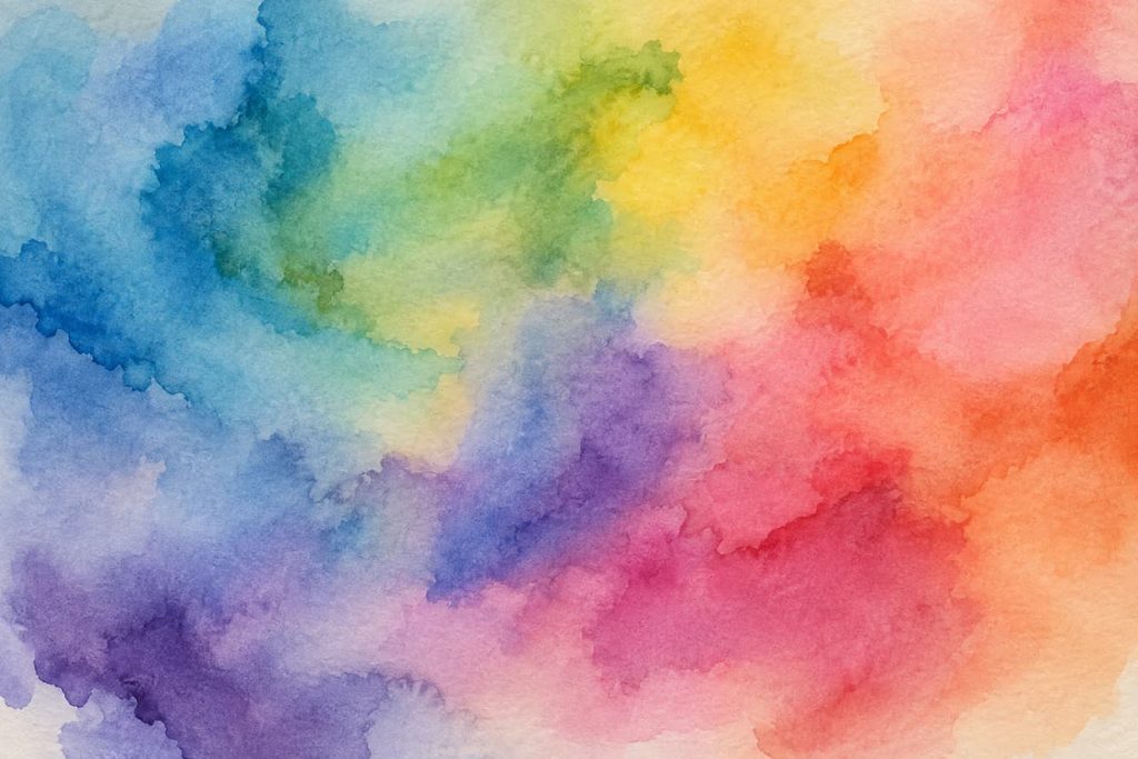
This consists of applying paint onto paper that is already wet, either with clean water or with a still-fresh patch of color.
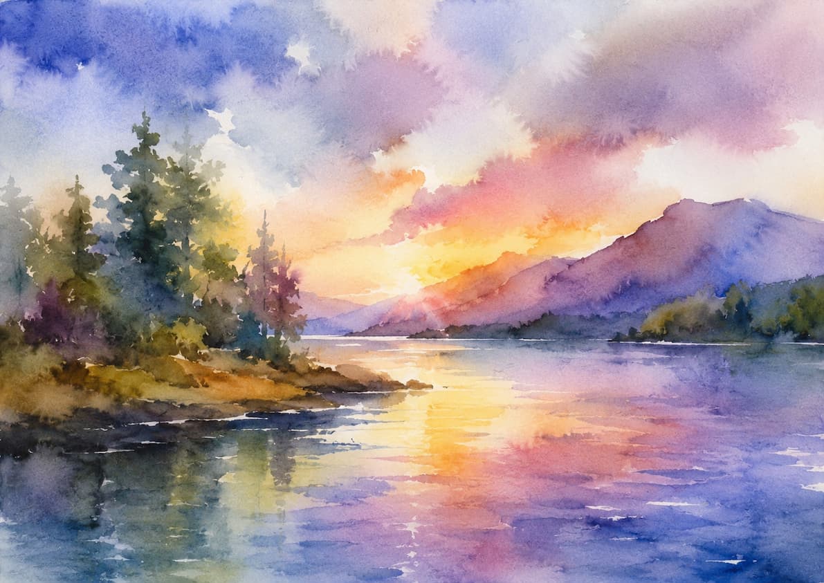
The result is a soft fusion, without defined edges. The pigment travels through the moisture in the paper and stops where that moisture ends. It is the technique for skies, atmospheres, backgrounds, distant areas, water, and anything you want to breathe.
How to do it
Wet the area of the paper with clean water and a large brush. The surface should look satin-like, with a sheen, but without puddles.
Wait a few seconds for the shine to start decreasing.
Load the brush with a more concentrated mixture than you think necessary (the wet paper will dilute it) and touch the paper.
Don’t touch it again. Let the water do the work.
The key: the sheen of the paper
Here is 90% of the control. Look at the paper from the side, against the light, and learn to read four states:
Puddle (shines strongly and moves): the pigment becomes uncontrollable and goes everywhere. Too early.
Satin (shines, but stays still): ideal moment. Soft and predictable fusions.
Damp matte (no longer shines, but feels cool to the touch): dangerous moment. If you add water here, the dreaded “cauliflowers” appear.
Completely dry: you are now using the next technique.
That is the real exercise for a beginner: not painting beautifully, but learning to recognize what state the paper is in.
Practical tips
Work with the paper slightly tilted; it helps the color move downward naturally.
Use 300 gsm paper, preferably 100% cotton. On cheap cellulose paper, the moisture disappears in seconds and this technique is almost impossible.
Load the brush well with pigment. The classic mistake is to water down the mixture on the palette and then wet the paper as well: the result is a pale, washed-out color.
If you are going to work wet for a long time, use a brush with a good water reservoir (petit gris, or high-capacity synthetic brushes).
2. Wet-on-dry (and dry brush)
Here the paper is completely dry and you apply the paint on top. The mark stays exactly where you put it, with a crisp edge.
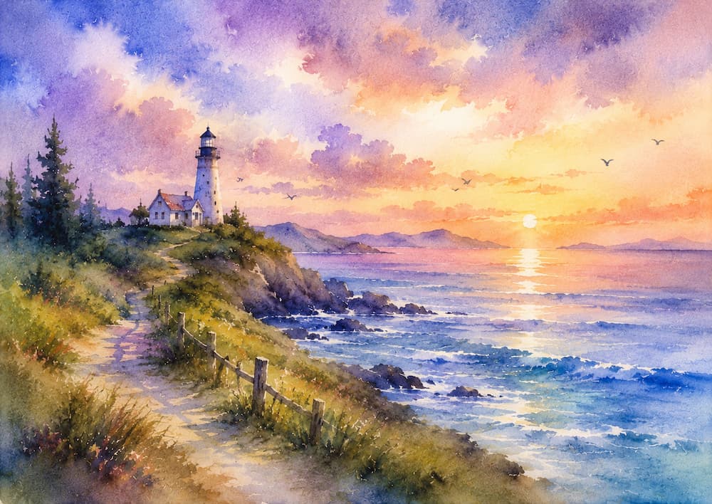
It is the technique of drawing within the painting: the branches of a tree, the frame of a window, the shadow of a building, a figure silhouetted against the sky. Everything that needs a recognizable shape.
How to do it
Make sure the paper is truly dry (cool on the back of your hand = there is still moisture). Load the brush, place it down, and draw. The less you go back over the mark, the better: watercolor loses freshness every time you disturb it.
Dry brush
It is a variation of the same principle: dry paper, but also a brush with almost no water, with the pigment almost in paste form. Drag the brush sideways across the paper and the surface grain picks up the color irregularly, leaving white gaps.
It is useful for textures: bark, rock, dry grass, wave foam, old wood, broken highlights on water. It works much better on medium-grain (cold press) or rough paper, because it needs relief to catch on.
Use it sparingly. Dry brush is very striking and that is why it is overused; it works better as an accent in a couple of areas than spread throughout the entire painting.
3. Glazing
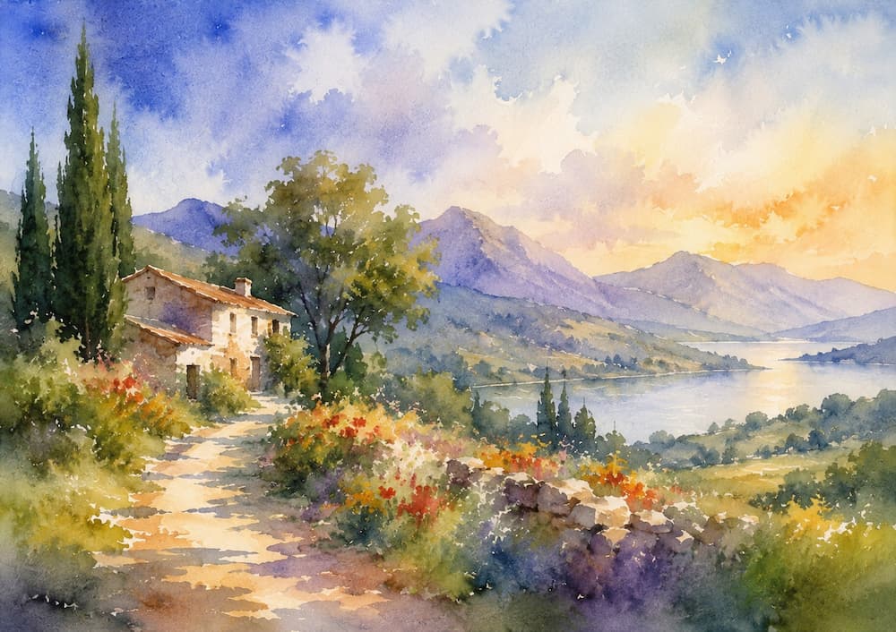
A glaze is a very diluted and transparent layer of color applied over a completely dry previous layer.
It does not mix the pigments as they do on the palette: it layers them. Light passes through both layers, bounces off the white of the paper, and returns to the eye. The color you see is the result of that journey, and that is why it has a luminosity that cannot be achieved by mixing on the palette.
What it is for
Unifying: a general glaze of a warm or cool tone over a scattered area brings it together instantly.
Creating atmosphere: a blue-gray glaze over a background pushes it away; a warm one over a foreground brings it closer.
Correcting without repainting: if an area has turned out too light or too cool, adjust it with a thin layer instead of attacking it again with dense color.
Shadows: many of the most beautiful shadows in watercolor are not painted gray, but glazed with a transparent blue or violet over the local color.
Rules worth not breaking
The layer underneath must be completely dry. If it isn’t, you are not glazing: you are disturbing the paint.
Loaded brush, loose wrist, one single pass. If you scrub, you lift the lower layer and muddy both.
Use transparent pigments. Transparent pigments (quinacridones, phthalos, transparent earths) glaze beautifully. Opaque and sedimentary pigments (some cadmiums, dense ochres, titanium white) cover and dull.
Be careful with pigments that “reactivate”. Some, such as many phthalocyanines, lift easily when you paint over them. Test first on a piece of the same paper.
Few layers. Two or three well-placed glazes give light; six give mud.
Two washes worth practicing separately
A wash is simply a large area of color. It sounds basic, and yet this is where you notice most clearly the hand of someone who has practiced.
Flat wash (uniform color). Dry paper, board tilted about 15°. Load the brush well and draw a horizontal band from side to side. A small accumulation of color forms along the lower edge: that bead is your ally. Reload the brush and draw the next band, picking up that bead, and continue all the way down. At the end, squeeze out the brush and absorb the excess from the last band. The golden rule: do not go back.
Graded wash. Same as the previous one, but in each band you add a little more water (to lighten downward) or a little more pigment (to darken). It is the basis of almost every sky.
A mediocre sky is usually a badly executed wash, not a color problem. Half an hour practicing washes is more productive than half an hour choosing blues.
A concept that connects the three techniques: edges
If I had to summarize everything above in a single idea, it would be this: each technique produces a different type of edge, and the painting is built by combining them.
Hard edge: wet-on-dry. Defines, cuts out, brings closer. Says “this is an object.”
Lost edge: when a shape blends into the background and disappears for a section, only to reappear later.
That third one is what distinguishes an interesting watercolor from a correct one. If every shape is perfectly cut out against the background, the painting looks like a cutout: rigid and without air. If you let the shadowed part of a roof blend into the dark sky, or let the base of a tree disappear into the grass, the viewer’s eye completes the shape on its own, and the result breathes.
Practical rule for beginners: hard edges where you want the viewer to look; soft and lost edges everywhere else. A whole painting of hard edges is tiring; one made entirely of soft edges is difficult to understand.
Lifting color: the possible correction
Watercolor cannot be covered up, but some color can be removed. It is not an eraser, although sometimes it saves a sheet.
With wet paper: squeeze the brush well (or run it over a cloth) and touch it to the area. The dry brush absorbs paint through capillary action. It works for opening up clouds, highlights on water, or the shine of a fruit.
With kitchen paper or a sponge: press without dragging, just when the shine begins to decrease. If you drag, you make it dirty.
With the paper already dry: moisten the area with a clean brush, wait a few seconds, and absorb with paper. Here it depends greatly on the pigment: staining pigments (phthalos, some quinacridones, alizarins) barely come away; sedimentary ones (earths, ultramarine blue, many grays) lift well.
Good paper = more room for error. Cotton can withstand repeated work; cellulose peels and produces an impossible-to-fix fuzz.
One warning: lifting color removes freshness. It is fine as an occasional resource, but poor as a working method. If you need to lift in five different places, the problem was probably in the planning, not the execution.
How the three combine in the same painting
In practice, you don’t choose one technique, you choose an order. The most common one is this:
Decide the whites before wetting anything. Where you are not going to paint.
Wet-on-wet for the large backgrounds and atmosphere. This is the moment for looseness and risk.
Complete drying.
Wet-on-dry for the shapes that need definition: silhouettes, architecture, branches, figures.
Glazes to adjust the whole: unify, add shadows, push the backgrounds backward.
Dry brush at the end, as a texture accent in two or three places.
Notice that you move from less control to more control, and from more water to less water. That is the natural logic of watercolor, and it is also the opposite order to the one almost all beginners try when they start.
An exercise for this week
Take a sheet of 300 gsm paper and divide it into four rectangles with a pencil.
Rectangle 1: wet with clean water and drop in two colors. Observe how they blend. Repeat it three times at different stages of drying (puddle, satin, matte) and write next to each one what happened.
Rectangle 2: on dry paper, paint five geometric shapes in a single stroke, without touching them up.
Rectangle 3: paint a flat background, let it dry completely, and apply three bands of glaze of the same color on top. You will see how each band darkens and unifies.
Rectangle 4: with the brush almost without water, drag dense pigment sideways across the paper.
It is not a painting and you don’t have to like it. It is a testing ground, and it will probably teach you more about water than the next three sheets you try to finish.
The three most common mistakes
Diluting too much on the palette. Watercolor lightens as it dries; if the paper is also wet, the color disappears. Mix more concentrated than instinct tells you to.
Not waiting for it to dry. Most muddy marks do not come from poor technique, but from impatience. Have two paintings in progress if you find it difficult to wait.
Going back over what you’ve done. Every touch-up removes transparency. The freshness of a watercolor lies in the marks that were left alone.
Watercolor cannot be completely controlled, and that is part of its charm. But there is a big distance between not controlling it and not understanding it, and these three techniques are precisely the bridge.
Vicente García Fuentes RI
Vicente García Fuentes RI es un pintor especializado en acuarela contemporánea, miembro electo del Royal Institute of Painters in Water Colours. Su beca de residencia artística en Islandia marcó su trabajo, centrado en paisajes nórdicos y marinos donde el hielo, el mar y la luz son protagonistas.
Este sitio web utiliza cookies propias y de terceros para mejorar la experiencia de navegación. Si continúa navegando por el sitio web entenderemos que acepta su uso.
This website uses cookies to improve your experience while browsing the website. Of these cookies, the cookies that are classified as necessary are stored in your browser, as they are essential for the functioning of the basic functionalities of the website. We also use third-party cookies that help us analyze and understand how you use this website. These cookies will be stored in your browser only with your consent. You also have the option to unsubscribe from these cookies. But opting out of some of these cookies may affect your browsing experience.
Necessary cookies are absolutely essential for the website to function properly. This category only includes cookies that ensures basic functionalities and security features of the website. These cookies do not store any personal information.
Las cookies que pueden no ser particularmente necesarias para que el sitio web funcione y se utilizan específicamente para recopilar datos personales del usuario a través de análisis, anuncios y otros contenidos integrados se denominan cookies no necesarias.